
Excess deaths are deaths that do not fit an expected pattern – what do they show?
After subtracting deaths attributed to covid, 2020 summer “excess” deaths (above and beyond covid and not flu) were about 91,000, 2021 summer about 88,000 and 2022 summer about 50,000, whereas the maximum summer before this, in 2017, was about 19,000.
March 20, 2023
Guest Perspective by William Briggs
This took a long time to get to, because we were waiting, patiently, for the CDC to count deaths. They are always eight to sixteen weeks behind. This is of particular concern to the last batch of data presented below. This means we can be confident the data won’t change much for all dates up to about the beginning of 2023.
The point of this post is to explore the limits of what can be known using the CDC’s limited data: that, and nothing more.
OBSERVATIONS
Here are the weekly deaths from all causes over the once United States, as affirmed by the CDC (new data is here; I no longer have a link for the old, but it’s CDC too).
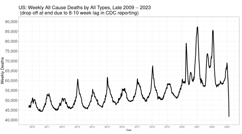
I hope this chart is so plain even an NPR listener can make it out. It should be clear that deaths always bottom in summer and peak in January, because why? Because January is when it’s cold, we all go inside to share bugs, disease burden increases and people, thus put upon, die. I ask you to remind yourself what solution experts first hit upon to “solve” coronadoom.
The drop off at the end is because it takes a good eight weeks, and sometimes as many as sixteen, and even more, to fully count deaths all across the country.
Some years before 2020 have higher January peaks than others. This is usually attributed to flu being more virulent, and indeed that explanation is surely true, especially because those peaks match up with flu deaths.
Not all deaths are classified as flu, however. The peaks match, flu and all death, but there are still peaks even after removing flu. The reason is causes of death are listed singly and not multiple. So a guy with CHF who gets flu weakens and dies after the flu has cleared has his death is listed as CHF.
The same could be true with coronadoom, of course, except for the zeal to classify any death as covid if the person died with a positive test. And, indeed as we saw, many deaths were classified as the doom even on suspicion, absent any test.
The spikes when the panic hit in 2020 and after are obvious. Too obvious, because we only begin our series in 2009, the data before that is difficult to locate (if anybody has, please send). Meaning we’re not seeing the large relative spikes for the Asian flu of 1957-58 and the Hong Kong flu a decade later, which both killed, the CDC says, at greater rates around the world than the doom. Yes. How soon we forget. There was no panic then, so no one remembers.
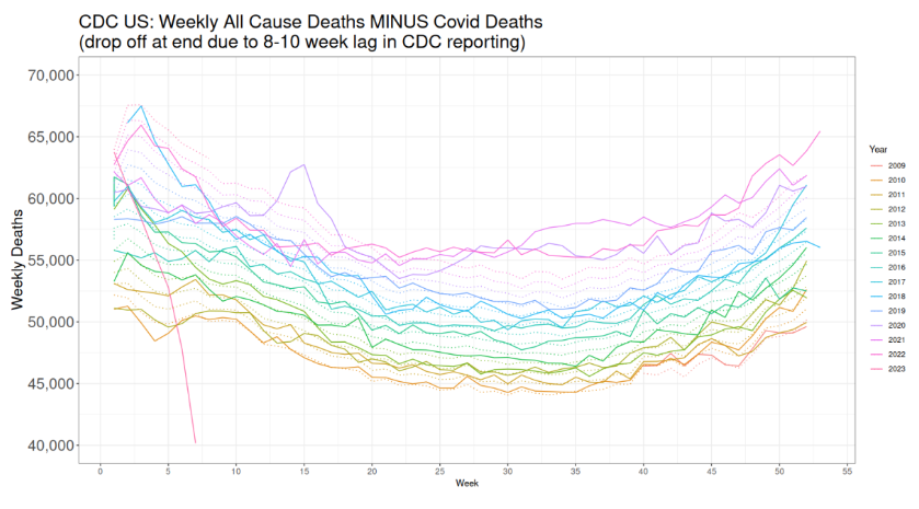
All right, let’s look at the same plot, this time subtracting attributed doom deaths:
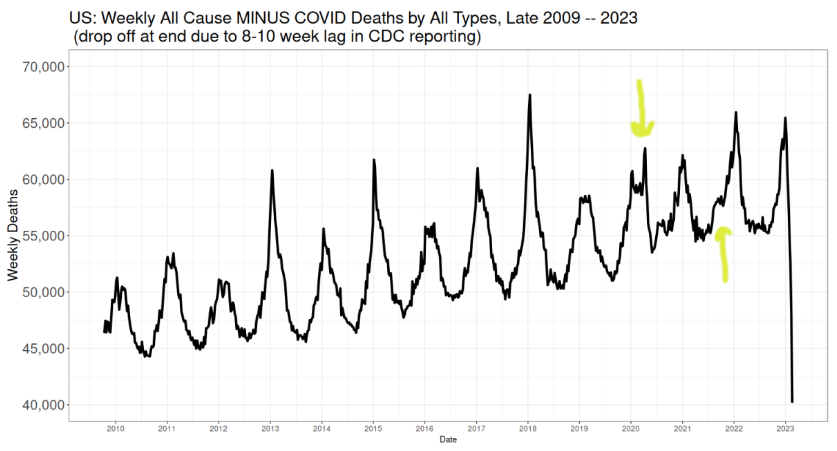
Recall the tremendous enthusiasm for attributing doom deaths. Motorcycle crashes, men falling off ladders, really any death in a person who had a positive test was accorded a doom death, and, as said, sometimes even without a test. It became ridiculous. For us what is important is that it is not at all likely doom deaths were under-counted. It is far, far more likely they were over-counted.
Any calculation of “excess” deaths would come from this picture, because these are the deaths from everything else besides covid.
There are two interesting features highlighted using sophisticated arrows drawn by Yours Truly. Keep these in mind. Two spikes in death that seem not to fit the pattern of previous years.
For that is what “excess” deaths are: deaths that do not fit an expected pattern. Expected being the key word. What does is mean? This: all “excess” deaths are in relation to a model. There is no escaping this. “Excess” deaths are always, absolutely always, conditional on a model. And as all models only say what they are told to say, we have to be sure our model is saying the right thing.
The right thing being what is expected. What is expected? Well, deaths with bottom out in summers, peak in Januaries, and with some January peals higher than others, and with summer bottoms pretty much the same, all embedded in a general, probably linear, increase.
All right, let’s look at the first plot again, all deaths including doom deaths, only this time year on year:
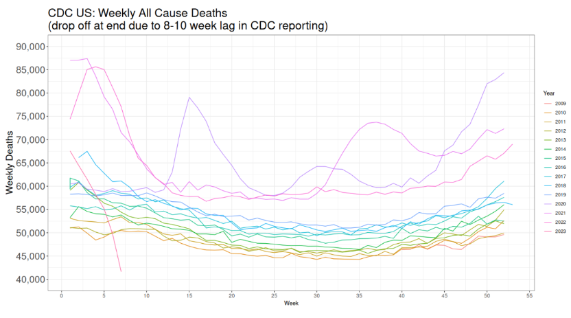
The 2020 spike when the panic began is obvious. As is the large bump in late summer early fall of 2021.
Another obvious feature of the first and this graph is the inexorable increase in weekly deaths. This is surely caused by an increasing and, to some extent, aging population. Up until 2020, it appears the year on year increase was fairly steady. Indeed, we make use of this in our “excess” deaths model.
Meanwhile, let’s redo the second graph, all deaths subtracting doom deaths, year on year:
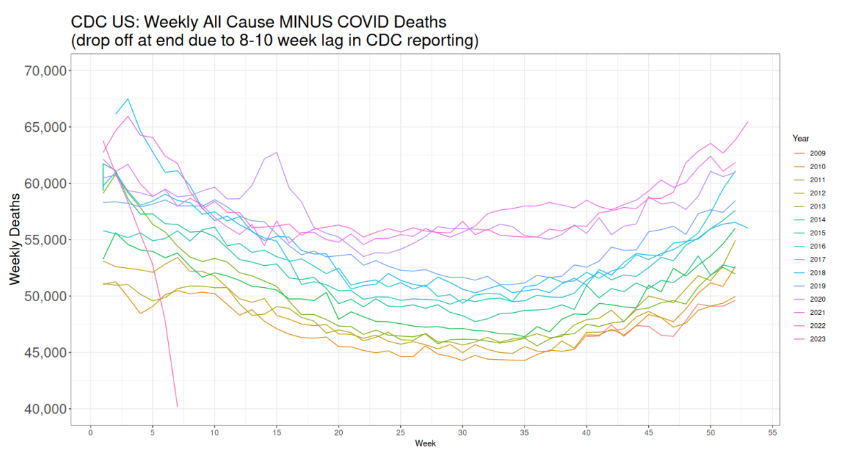
As in the second plot, there’s the strange 2020 bump, which has to be something other than covid deaths, because we are assuming it more likely covid deaths were over-counted. We also see more clearly the summer and fall numbers for 2020, 2021, and 2022 are higher than expected—again, where by “expected” I mean they don’t fit the pattern of previous years.
“EXCESS” DEATHS MODEL
We are now ready to begin our model. I tried two. One, which I won’t show, is a mixed time series model (sine+cosine) with increasing trend. This fit well enough, but over-smoothed the data, and missed that the increase in deaths from 2009-2019 was not quite linear.
The second model, a standard regression on weekly year on year increases, I think is superior because it catches the differences in weekly increases, a model which errs on the side of simplicity. The model builds a separate regression for each week on the years 2009-2019, i.e. a simple linear increase for each week, then predicts the weekly deaths for the years 2020-2023.
(Some will complain “This ignores the correlation between weeks!” Yes. It does.)
The data used is as you see above: All Cause MINUS Covid deaths.
Here is the time series picture of all deaths minus doom deaths, with the model overlaid in green:

It must be noted that 2018 was a big flu year, with many more deaths than previous years. A lot of people who might have died in 2019, which was a very low year, died in 2018. But because 2019 was a low flu year, 2020 was ripe for a larger number of people to die, of whatever cause.
Look from 2009-2019, the model fitting period. The model fits well. It particularly fits pretty in the summer. It nails summers. It also does well in springs and falls, but not quite as well as it did in summers. It doesn’t fit as well in Januaries, smoothing out the spikes; i.e under-predicting in high flu years and over-predicting in low flu years. This is because, of course, the unpredictable variability of flu. The model does get right the average of those peaks (while also accounting for the increasing trend).
The interpretation is this. The pattern is that summers are low, which the model catches nicely, and that winters are high, which the model over-predicts in low flu years. Meaning we can likely trust this model to compute “excess” deaths, i.e. deaths that don’t fit the usual pattern, and understanding the “excess” will be positive when flu years are high in reality, and negative when flu years are low.
And there was no flu starting in spring 2020: it almost disappeared. It has returned only this winter. So negative “excess” deaths when flu is gone will be very low, as we see.
We’ll discuss 2020-2023 in a moment. First, here’s the year on year, all cause minus covid, with the model overlaid, but here as dotted curves matching in color to the years.
That 2020 spike is anomalous. It does not fit the pattern. The deaths are not doom deaths, but something else, as we suppose. The summers and falls of 2020-2022 are also higher than predicted, and we know the model fits well in the summer. These deaths are also anomalous. They are higher than expected.
We finally come to “excess” deaths, shown in this time series:
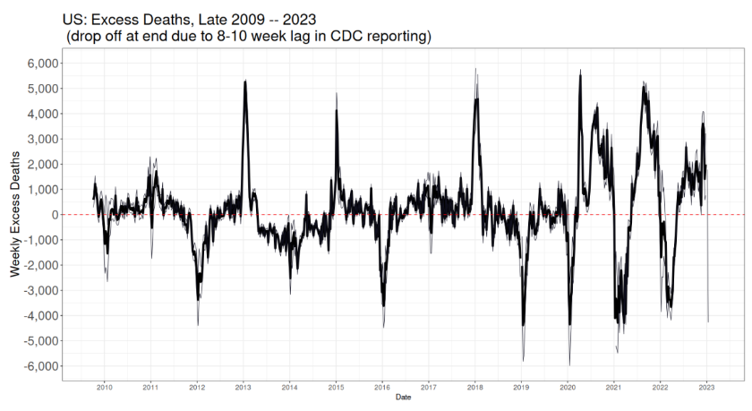
This in solid black are all non-covid deaths (all cause subtracting covid) minus the prediction. That is, those deaths that are not “expected” (the model is the expectation). The light grey lines are the 50% prediction window. We need some kind of window, because we have a model, and it makes predictions which are uncertain (why 50%? why not? 95% is just silly, anyway the uncertainty is not large). We saw the uncertainty was low in spring through fall, but higher in winter.
Let’s start by looking at 2009-2019, the mode fitting period. The positive spikes correspond to high flu years, and the negative ones to low flu years, as explained above. The spikes are narrow, lasting only a few weeks, which also matches our expectations of seasonal disease and death.
We see again that 2019 was a low-death year, so that “excess” deaths spiked negative.
This was also true in first two months of 2020, the year the panic began. Then came a large spike in spring, which are not, we emphasize, doom deaths, because we’re assuming all doom deaths were counted, or even over-counted.
Then we see large extended positive spring, summer, and fall spikes in 2020–2022. And negative spikes in winter for all these years.
Let’s discuss the negative spikes first. Go back and look at the previous figure. The green line assumed we’d see the “normal” flu pattern. Flu practically disappeared all over the world during these years. So the winter peaks were actually quite low, much lower than expected. recovering somewhat in 2022. (Flu has now returned.) The spikes in winter were also shorter lived than normally seen.
This means the negative “excess” winter deaths are likely put down to missing flu.
What about the positive spring through fall spikes?
The largest positive spike was in spring 2020, right when the panic hit. These deaths, as we’ll see in a moment, were probably to good extent iatrogenic. This was when doctors thought it well to force many patients on ventilators (remember the Great Ventilator Manufacturing Scare?). Treatment was over-aggressive. People were killed. Could some of these deaths be missed doom deaths? That’s a possibility, of course, especially since we were in full fear panic hersteria. However, not all these deaths could have been doom deaths, as we’ll see.
The summer-fall peak in 2020 was larger than the summer-fall peak in 2021. Vaccines did not really get started until 2021. Which means that 2020 “excess” deaths had to have other causes. In 2020, many were likely panic deaths, at least to some extent. People frightened away from seeking treatment for non-doom diseases, that sort of thing. And, yes, it is possible, though not likely, some of these were missing doom deaths.
The 2021 positive spike was larger than the 2020. Assuming the same level of panic, the only new thing were variants of the doom—and the forced vaccinations. Which continued into 2022, which saw the vaccination push and the panic toned down, but not yet called off. (Thanks to Experts at CDC.)
Now it turns out that the “turn”, the time at which the winter peak ends and summer begins is at the ends of May. This last until right around Christmas, after which “excess” deaths peak up (when they do). We guess that the large negative spikes are due to missing flu. Something must account for the larger summer peaks, especially after 2019.
Here, then, is a chart of the “excess” deaths from the last week of May through about Christmas, from 2010 to 2022:
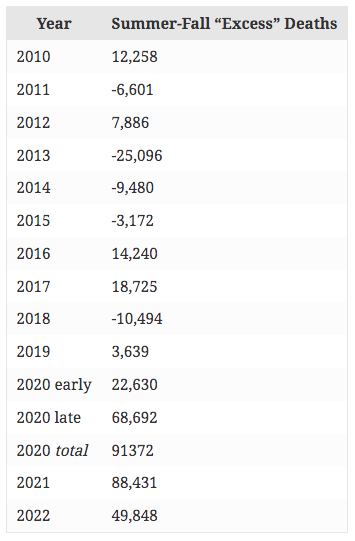
The 2020 early is 2020-03-28 to 2020-05-30, and late is the week after through 2020-12-26. The week after this, “excess” deaths turned negative. Thus, after subtracting deaths attributed to covid, 2020 summer “excess” deaths (above and beyond covid and not flu) were about 91,000, 2021 summer about 88,000 and 2022 summer about 50,000, whereas the maximum summer before this, in 2017, was about 19,000.
The early peak of “excess” deaths in 2020 was about 23,000. We guess why in a moment. The late summer-fall peak was about 69,000. There was no vaccine available (in any number) until 2021. “Excess” deaths then were about 88,000. That means the 2021 summer-fall beat 2020 summer-fall by about 20,000 “excess” deaths. Some of those could, of course, be associated with vaccines.
So we have some circumstantial evidence vaccinations were responsible for some deaths. As has been widely noted, deaths are never classified as “vaccine deaths”. So not only is there no direct data on this, there cannot be. We have to guess. Because we are forced to guess does not mean that vaccines could not cause any deaths, nor does it mean they did. It means that everybody, on any side of the debate, is forced to guess. Using data like this.
Now this “excess” death plot also shows the futility of looking at yearly numbers. Summers are not the same as winters in disease characteristic. Yearly sums smear out the signals, and can be misleading.
Before we continue, let’s peek at the official causes of death time series:
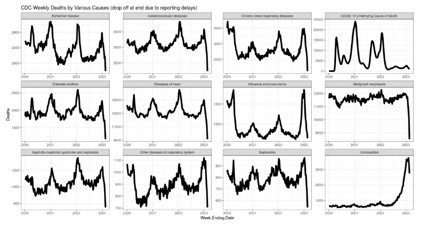
Note septicemia (bottom row), which shows the same spike as the spring 2020 deaths. Septicemia means deaths by infection, almost certainly in hospitals. And again, likely from over-aggressive panic treatments of having tubes crammed down peoples’ throats.
You’ll see also with that, as with the other diseases, the expected winter peaks in deaths. Notable is Alzheimer’s, which peaks in winter, too, but which shows a definite downward trend in the peaks. This is surely caused by fewer old people being left alive, as the old were killed at the highest rates by the doom. The weakest were cleared out early.
Flu bottomed out, then returned. Excepting anything to do with breathing, all diseases spiked highest in winter 2022—right after the forced vaccinations, but also after a peak in doom deaths; however, the peak in doom deaths was smaller in January 2022 than 2021. Respiratory diseases also spiked, but even higher in 2023. If doom deaths were under-counted, which does not seem likely, they’d be found here.
Which means the spikes in other diseases, which all happened during the vaccination panic, are curious. They don’t fit the pattern.
Is the winter 2022 spike caused by vaccines? Maybe. We have to guess, and that “maybe” is the best we can do. Worse, I can’t find data at this level of specificity before 2020 from the CDC (if anybody has, email me). So we’re left with considerable uncertainty.
Lastly, here are the non-covid deaths (all cause minus covid) for various age groups. Again, only data from 2020 is available.
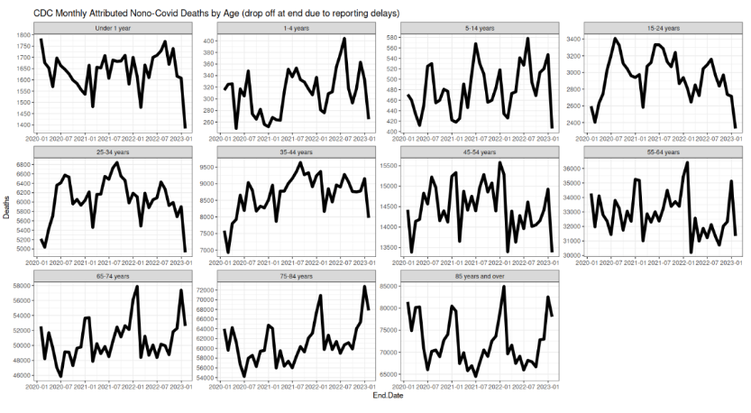
Note the changing limits on the vertical axes.
The largest spike is for the older, 45 years and up, in winter 2022. It was not flu. It was not covid, we assume. It had to be something else. What causes were available? Complications from covid are possible, but not likely, given the zealousness to classify deaths are from covid. (The plot above counts across all age groups.)
The younger are different. Their peaks come in summer, which in part is not surprising, given that this is the prime time for accidents of all types, and the young suffer these more. That becomes clearest in those 1 to 34 years old. If there is a vaccine-cause death signal here, it is difficult to see.
So there it is. No definitive answer, and one cannot be had. There is at least good circumstantial evidence vaccines could explain some deaths, especially in those 35 or older. It is just ambiguous enough for those who hold it impossible vaccines can cause harm to dismiss the lot. But neither is the signal so strong that the vaccinated were harmed at large rates, if they were harmed at all.